ProjectMatch
ProjectMatch is a web interface designed to effectively match volunteers attending Code for San Francisco hack nights with appropriate civil coding projects based on their skills and interests.
Overview
Code for San Francisco is a volunteer brigade focused on using technology to tackle difficult civil issues, such as public transportation and homelessness. During the weekly hack nights, project ideas are pitched, teams are assembled, and problems get solved. In theory.
Unfortunately, the very volunteer nature of the initiative makes it difficult to maintain a reliable, consistent team, further compounded by the lack of a firm onboarding process.
When volunteer talent such as myself walks in the door, they expect a clear avenue to follow to find a home. As independently operating teams working on limited resources and tight schedules, the onboarding process is often overlooked. Volunteers have to find their own way onto a project, which is more often than not a group of heads bent low over screens, brows furrowed in concentration.
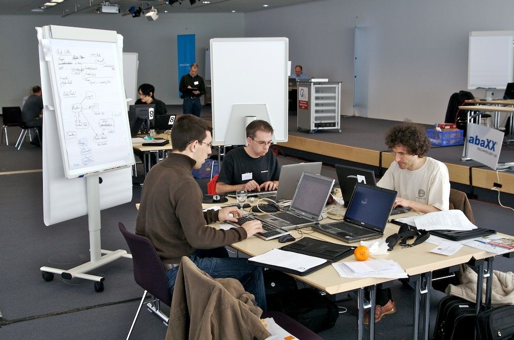
“Hi, just heard about your project… you guys need any UX work done?”
What if there was some way to list active projects in an easily accessible space, and include relevant data such as contact information and skills needed to help volunteers join up in an efficient manner? True to Code for San Francisco’s mission, we turn to technology to solve this problem.
Problem Statement
Our goal for ProjectMatch is to improve the volunteer onboarding and integration experience to maximize retention by providing:
- An intuitive interface for project managers to create and maintain an accurate and accessible overview of their project goals, needs, and development stack.
- A compelling way for volunteers to discover and get on board with projects that fit their interests and skills.
These two highlighted words best capture the experience I wanted for my users. If volunteers were energized through the process of discovering a role on a team closely aligned with their skills and interests, I theorized they would feel motivated to return in the future.
Users and Audience
ProjectMatch addresses the user flows from both sides of project team building: Project Managers looking for team members, and Volunteers looking for projects to join.
sequenceDiagram
Volunteers ->> ProjectMatch: Intake Form
ProjectMatch-->>Team Leaders: Relevant skill match
ProjectMatch-->> Volunteers: Relevant interests match
Team Leaders->> ProjectMatch: Project Profile Form
Note right of Team Leaders: This process was informally<br>done by talking to people at<br>the hack night when I arrived.

ProjectMatch-->Volunteers: Search Projects by keyword
Volunteers->Team Leaders: Recommend projects to Volunteers
With this in mind, we focused on two key interaction points:
Provide a project profile creation form to guide Team Leaders in adding effective descriptions and keywords.
Provide an interface for Volunteers to discover project profiles: either by actively searching/browsing by keyword, or by viewing suggested projects based on their own profile keywords.
Scope and Responsibilities
The scope of my involvement was to test out the initial prototype of our intake form with real users and make sure the team was on track to hit usability goals for its MVP release, or Minimum Viable Product.
The Process
To accomplish this, I followed a simple action plan to gather as much relevant data as quickly as possible:
Review existing project requirements and design documentation.
Write user testing scripts, recruit users, and lead test sessions.
Review session notes with UX team to identify trouble areas.
Present findings to dev team and advocate for UX changes.
Informed Design
To illustrate the extent of the very problems ProjectMatch was designed to solve, the service itself had already been under development for nearly two years before I started attending hack night. As luck would have it, I arrived right as the user research and testing phase kicked into high gear.
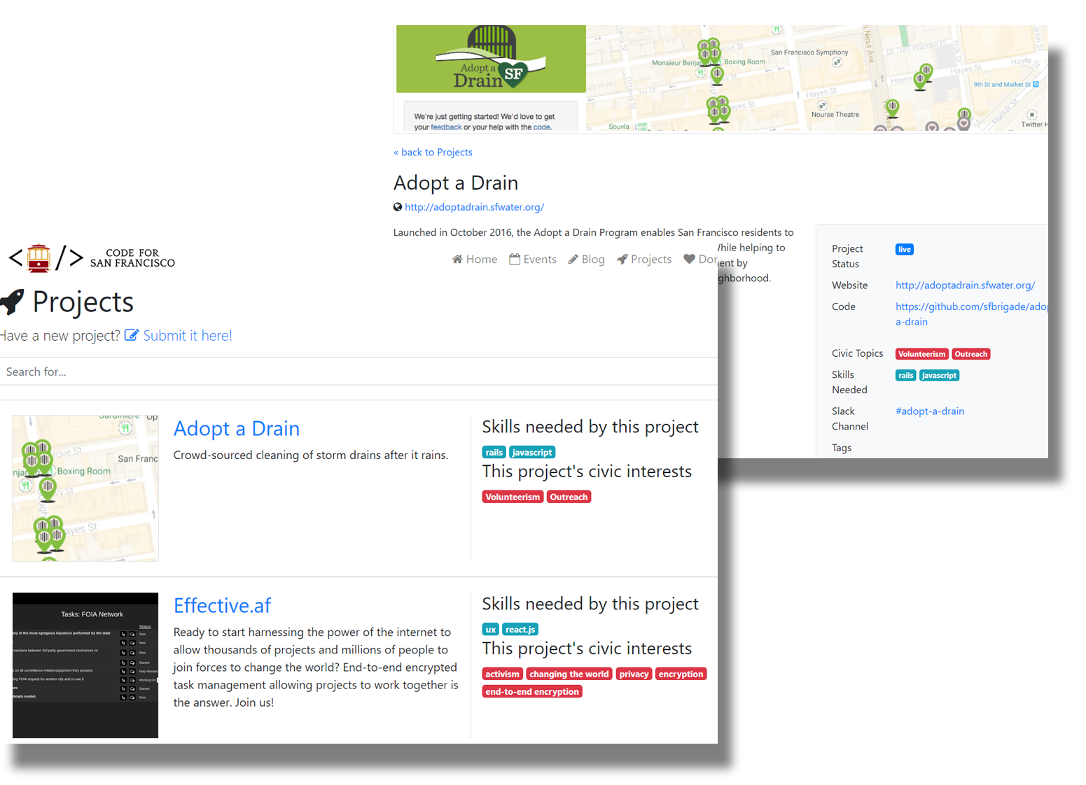
Code for SF’s project landing page when I arrived. Needs some work!
To kick off, we identified pain points for both the project leads creating projects and the volunteers interacting with their content. An early issue was that team leaders simply wrote too much in their project descriptions, or were too vague in their details. To solve this, we made the design decision to use a table of specific taxonomy from which project descriptions could be built. The table was intended to keep things simple, while being in-depth enough to keep team leaders from feeling constrained.
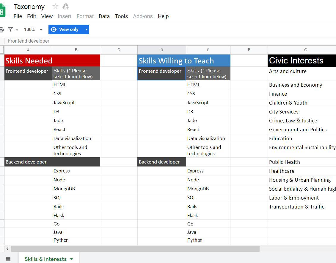
Part of the taxonomy table for building project descriptions and user profiles.
To input the taxonomy as well as further descriptions and information about projects, we put together a Google doc form with specific prompts and tips for project leads to follow when creating their project.
https://res.cloudinary.com/daeqdqfau/image/upload/v1628620721/Google_Form_bc7e74cdbd.jpg)
An early version of the project input form. I pushed for simplifying this form as much as possible.
User Testing
Next, I put together a user testing script and recruited current team leaders to sit in front of the intake form and walk me through a live test run of creating profiles for their projects. I observed their actions, asked questions about their experiences, and recorded everything I could.
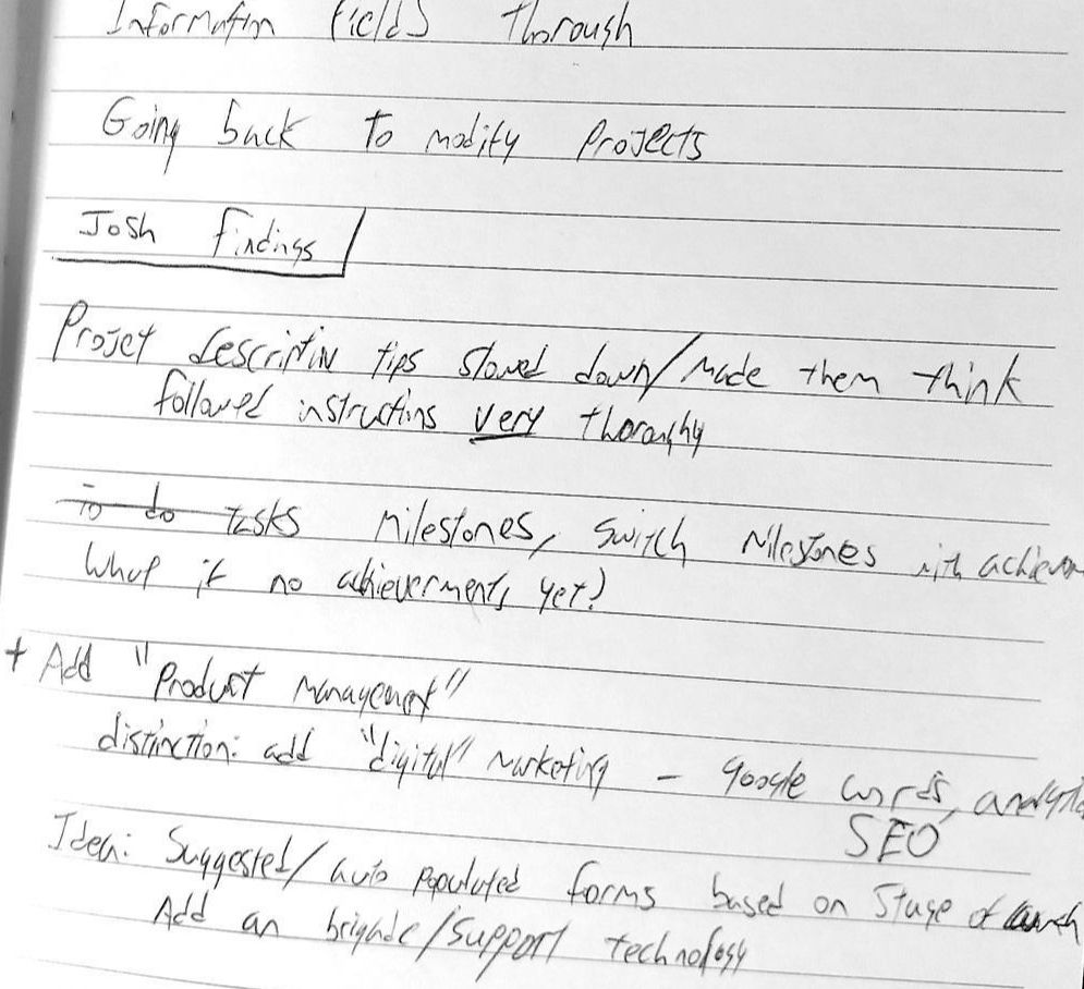
Quickly taking notes while running the user test session.
After the sessions, I isolated any additional pain points and trends from my findings, and put them forward in a meeting with my fellow UX volunteers to brainstorm ways to improve the form.
Outcomes and Lessons
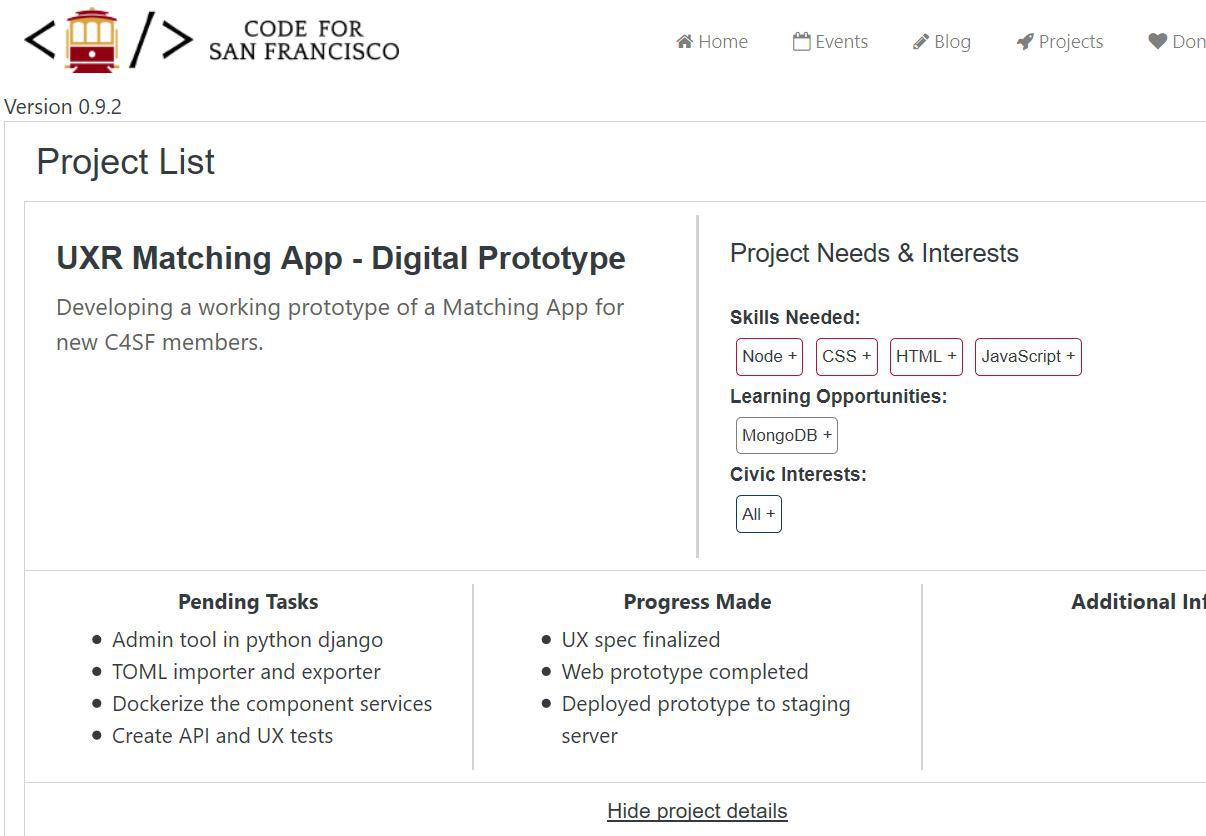
The prototype going live on the staging server.
My testing sessions with the team leads identified some easy opportunities for us to improve the overall project profile creation process. Some of my highlighted improvements included:
- Increasing clarity in the form language and instructions.
- Speeding up time-to-completion by consolidating certain forms.
- Refining the taxonomy by removing unnecessary keywords and adding others.
Initial information gathered by the form is stored as a TOML file for parsing by the new service implemented into Code for SF’s web site. An acronym for Tom's Obvious, Minimal Language, TOML’s simplicity and readability lends itself well to a volunteer-oriented community as changes can be made quickly and easily by project leads of any level of technical knowledge.
Next Steps
With the team lead side of the service tested and refined, the prototype was given the green light as minimum viable product. But the work had only just begun; to achieve our goals for an intuitive and compelling interface, we needed to begin testing the volunteer side of the system as well as make further UI design decisions and mockups with progressing fidelity.
With Code for San Francisco’s already minimal logo quality and heavy programming demographic, this meant an end to my contributions to the UX research itself, as I found my graphic design background now in high demand. The experience was short and sweet; I felt my confidence and direct approach in getting the answers I needed was highly valuable to the team.